
Sunday, 7 October 2012
Thursday, 4 October 2012
Particle Systems!
For the past couple of days, other than doing the usual processing work, I have been getting back into the habit of playing around with Maya. I started off getting reacquainted with the program and then once caught up on what I already knew I decided to push my knowledge a little further and experiment with particles. There was a preliminary experiment to this video however its not as emotive or awesome as this one is.
I made this for a girl called Emily. Its an abstract piece based on emotional life experience (of finding love and all that jazz).
The music is Nannou by Aphex Twin.
Monday, 3 September 2012
FPGA Tomfoolery
Against great odds It seems an elegant mix between my bitcoin mining hardware and art has come to fruition. Spawning THIS:
A couple of days in planning and a bit of tweaking at the end has got this FPGA running at ~228MH/s@228MHz.
Add in a fan for righteous cooling, and it will stay that way.
Then add in some night lights, so you can see your keyboard as you vent your frustrations at the internet late into the night.
Make it adjustable so you can sleep if you want to.
AND
WE HAVE LIFTOFF!!!
First Processing sketch
This is my first uploaded processing sketch.
This was generally an exercise in using functions and getting processing to do what i want. Soon enough I might update this with the ability to "listen" to sound and music and derive its activity (and possibly colour) from beat, frequency etc.
It's called "Crosses" and I've also chosen to release it under GPLv3.
Thursday, 23 August 2012
Processing and attractors
Fooling around with Processing and a general interest in fractals and attractors has led me to this site:
Attractors and Fractals
The code that page contains is some very well designed code.
The user interface is convenient enough for the average user to work out what it does.
The pass based rendering system is actually very nice, however much modern computers could handle live rendering.
Monday, 25 June 2012
Company animations
I've been becoming more and more fascinated with film credits, and so I've been making more of them.
this is one for a fictional company called Bent Ring.
It was really created so I can explore and manipulate liquids in Maya, hence the centre of the rings..
I dislike the fade in of the text so I will probably change that. Update: This is the new version:
this is one for a fictional company called Bent Ring.
It was really created so I can explore and manipulate liquids in Maya, hence the centre of the rings..
I dislike the fade in of the text so I will probably change that. Update: This is the new version:
Wednesday, 6 June 2012
GOON!
My increasing alcoholism has given me a deeper appreciation of a certain cheap wine.
In homage to that cheap wine I have created this.
I like the little things at the start of animated movies (the credit for the animation company) and I liked making this so I'll probably create a few more.
Creating this was quite simple, I learned how to attach a brush to a curve, manipulate curves better and easier.
Im quite happy with this one, however it could have done with a little bit better lighting (not as intense and white).
Creating this was quite simple, I learned how to attach a brush to a curve, manipulate curves better and easier.
Im quite happy with this one, however it could have done with a little bit better lighting (not as intense and white).
Sunday, 3 June 2012
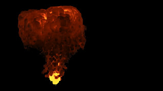
Exploding Moon
I created this in maya after playing around a lot more with dynamics and shatter effects.
pretty basic but it was a lot of fun to make.
pretty basic but it was a lot of fun to make.
Friday, 25 May 2012
Playing around with Maya
After much trepidation and sleepless nights I'm finally able to say that I feel relatively confident in my skill with a 3D modelling program...
I'm only able to say this because I tonight produced something that I'm actually happy with. Enjoyable as it is to mess around with polygons, bump mapping, nDynamics, texturing, artificial lighting etc. having something to show from all the time invested is nice as well... Here is one of the products of that time invested...
A Shattered Moon...


EDIT:
More snaps!


Thursday, 29 March 2012
Frank Lloyd Wright
I've been doing research for my Art Theory course, on the topic of modernist architecture.
I'm reading through a large number of journal articles on Frank Lloyd Wrights architecture, and he did have a lot of things to say about art in general that seem to make a lot of sense to me in a way.
In an academic sense the concepts that he conveys through his writing, and that is embodied in his architecture, speak to me in a way that I haven't found many others to.
A particular example is an excerpt is this one:
"Consistency in grammar is therefore the property -solely- of a well developed artist-architect. Without that property of the arist-architect not much can be done about your abode as a work of Art. Grammar is no property for the usual owner or the occupant of the house. But the man who designs the house must inevitably speak a consistent thought-language in his design. It properly may be and should be a language of his own if appropriate. If he has no language, so no grammar, of his own, he must adopt one; he will speak some language or other whether he so chooses to or not."
(Wright F.L, 1954 The Natural House, pages 182-183)
This excerpt is the first written example this concept I have found so far (maybe I'm just not as literate as I thought I was).
I interpreted this as applying to all art, as opposed to being useful merely to the "artist-architect".
Using consistent "thought-language" in an art piece is important and a concept that I think is often overlooked when comparing a seemingly well structured piece and a not well structured piece.
Often I have found myself admiring pieces that have consistent thought-language and grammar throughout.
A couple of artists and pieces that I feel follow this very structurally sound model of creative design through thought language are Boards of Canada (in particular Geogaddi and The Campfire Headphase), Venetian Snares (Rossz Csillag Alatt Szuletett and Detrimentalist), Anthony Fransisco Sheppard (Two Against One and Blockhead - The Music Scene), and Naoto Hattori (in particular his symbolic/communicative work).
I find this kind of expression a very satisfying model to use to consider the quality of art, or at least whether I have a purely physiological reaction to the piece or whether I have an aesthetic attraction to the artwork/artform itself.
Another property that I have noticed of these structured and consistent pieces is that their aesthetic form and their function are blended. When this happens, and is accompanied by consistent grammar, it seems to have a synergistic effect on the piece.
I notice now that FLW was the a major proponent in the adoption of this concept (form and function are one) and have now completed a circle back to my original point.
I will end here.
Thursday, 22 March 2012
Messing around in final cut
So I was messing about with FC Studio waiting for a friend to pick me up, and I started playing with some of the filters. This resulted in a very short... thing... that me and my girlfriend really like.
Despite its simplicity it was quite hard to produce, each character was individually animated with the text scrambler. Basic fade ins/outs.
Then stuck some white noise to the back and gave it a build up for dramatic effect.
And done.
Thursday, 8 March 2012
NO LONGER my main piece for Digital Video
So this post was for the first project for digital video.
I'd been creating a calming advertisement to try and get people out and about.
Not hugely filled with effort, and I didn't spend a huge amount of time thinking about the layout or storyboard etc.
I got most of my influence for this piece from the movie Baraka, and Boards of Canada (as can be seen that I'm using one of their songs for the audio track).
Ideally I would have loved to do this piece in widescreen with 12 panels instead of just 9 however this would have taken me too long, and I didn't want to go overboard. Not just yet anyway.
Most of the time that I spent creating this piece was timing the fade ins and outs for the different panels, so I didn't do anything particularly complex, maybe in a future piece I will go back and explore doing this in widescreen with more panels and more complex fade ins/outs for them.
Also with the fade ins/outs the last pale to be displayed does take a little longer to fade in and also is left to fade out a little longer. This was done intentionally to bring sue resolution to the action, and to draw the the sequence out a little longer to give a more calming effect.
I tried to make sure that I didn't use the same clip twice for any of the panels, I did this by renaming all the clips that I used in the previous wave before moving onto the next one.
I got the panels symmetrically placed and evenly spaced by placing the corner one and then placing the rest based on the values of the location of that corner in relation to centre (i.e. the bottom corner was at 226,174, the centre at 0).
The text used in this piece is designed to be personal, so that it can be a little funny towards the end. The video calling you a lazy bastard would be quite insulting if the video didn't a) introduce itself, and b) use slang implying friendship/personality behind the video.
This is my first experiment in giving character to a video, hopefully this will evolve into being able to develop some more interesting and relatable characters, rather than ones facelessly that tell you to go outside.
I really like this piece, its slightly humorous, touches on an issue which is difficult for many people act on, and in my opinion stylistically enjoyable to watch.
The video should be embedded below.
And some screenshots of final cut during production should be below that.


Anthony Francisco Shepperd Animations
Just posting some animations that i have real respect for the animator.
This is a music video for the band Blockhead and their song "The Music Scene".
The animator is Anthony Francisco Schepperd.
This is a music video for the band Blockhead and their song "The Music Scene".
The animator is Anthony Francisco Schepperd.
Subscribe to:
Comments (Atom)